Every time you choose a throw blanket, select curtains, or pick out bed linens, you’re making a statement that goes beyond aesthetics. Colors have the power to influence mood, affect behavior, and even change how we perceive space. In the world of home textiles, understanding color psychology isn’t just about looking good—it’s about creating environments that support well-being and personal expression.
When you walk into a room, what catches your eye first? Often, it’s the colors that surround you. But did you know that those same colors might be subtly shaping your emotions, energy levels, and overall sense of comfort? This is especially true when it comes to textiles—the soft fabrics, cozy throws, and vibrant cushions that make our homes feel like sanctuaries. Color psychology in home textile design isn’t just about following trends or matching paint schemes. It’s about creating intentional spaces that reflect who we are and how we want to feel each day. Whether you’re redecorating your entire living room or simply replacing your bedroom sheets, understanding how different hues interact with our minds and bodies can transform your space from merely decorative to truly therapeutic.
Understanding Color Psychology Fundamentals
Color psychology is the study of how different colors affect our moods, behaviors, and perceptions. It’s based on scientific research showing that our brains process color information differently than other sensory inputs. When we see certain colors, our brains trigger chemical responses that can either energize us or calm us down. For example, red stimulates the nervous system and increases heart rate, while blue tends to slow things down and promote relaxation. In home textiles, this means choosing the right hues for the right spaces. A living room might benefit from warm yellows that encourage conversation and creativity, whereas a bedroom could thrive with cool purples that signal restful sleep. The key is recognizing that every textile element—from the patterned rug to the subtle accent pillow—carries psychological weight. Think about it: when you reach for a particular blanket, do you instinctively choose something that makes you feel peaceful, or perhaps something that gives you a boost of confidence? These choices aren’t random—they’re rooted in how our brains respond to visual stimuli.
Warm Colors and Their Emotional Impact
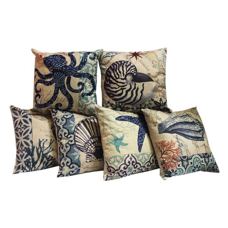
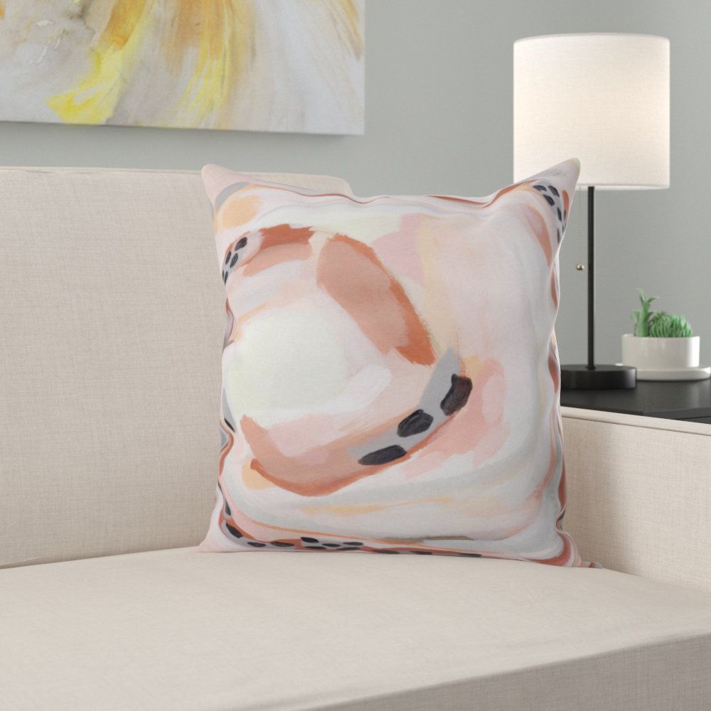
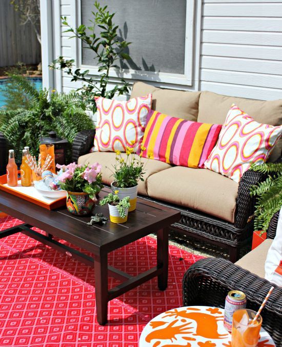
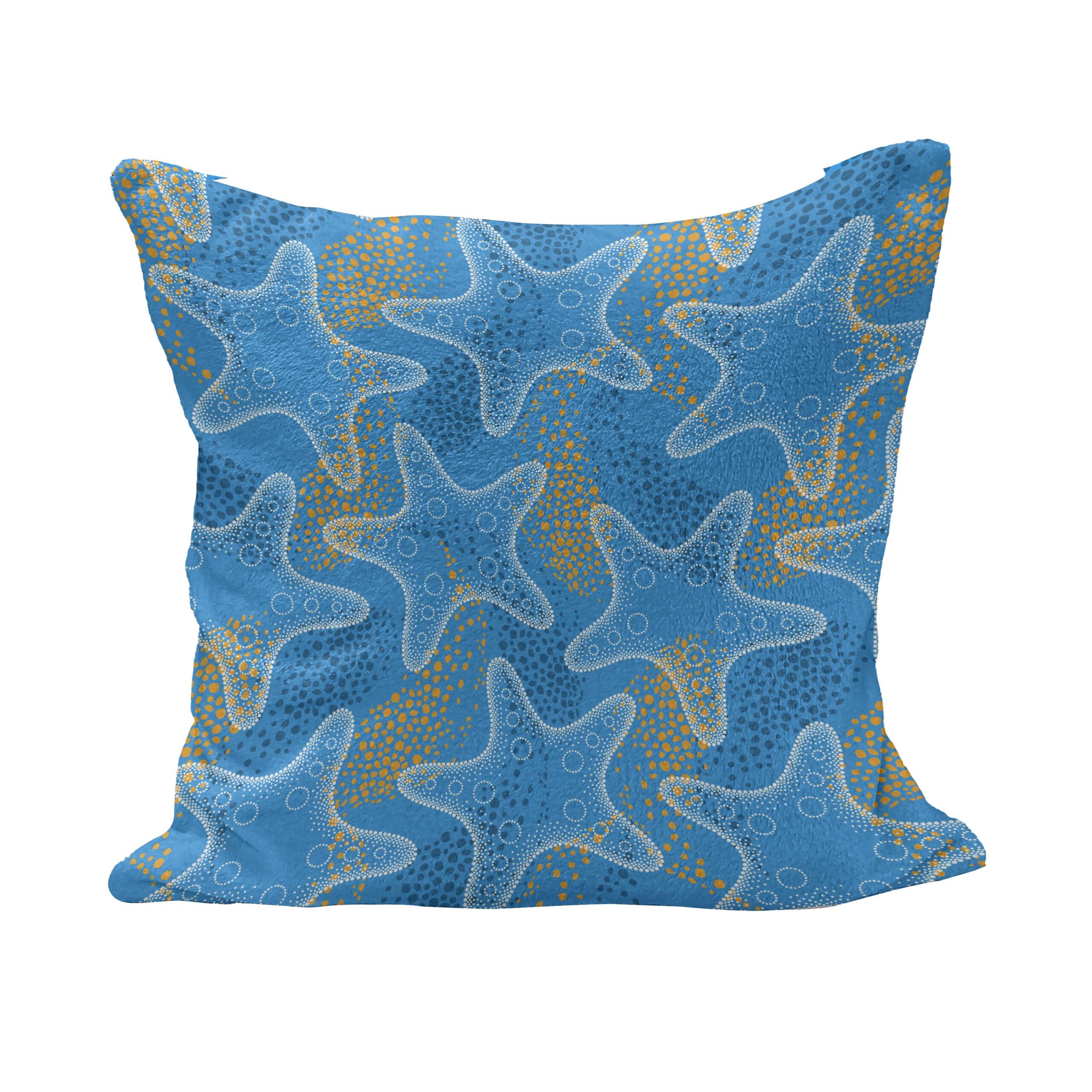
Warm colors like reds, oranges, and yellows are often associated with energy, passion, and social connection. These hues are particularly effective in communal areas such as dining rooms and family living spaces. Red textiles can add drama and excitement to a room, making them perfect for statement pieces like velvet cushions or bold area rugs. Orange brings enthusiasm and warmth, ideal for cozy reading nooks or playful children’s spaces. Yellow, the most uplifting of the warm palette, can brighten dark corners and create a cheerful atmosphere. However, these colors should be used thoughtfully. Too much red might make a space feel overwhelming, while excessive yellow can cause anxiety. The trick lies in balancing these powerful hues with neutral tones or cooler accents. Consider using a warm red throw on a neutral sofa rather than a red couch that dominates the entire room. This approach allows the emotional benefits of warm colors without overpowering the space. Many interior designers recommend starting with small amounts of warm colors in textiles, such as a vibrant red pillow or orange throw, to test their impact before committing to larger pieces.
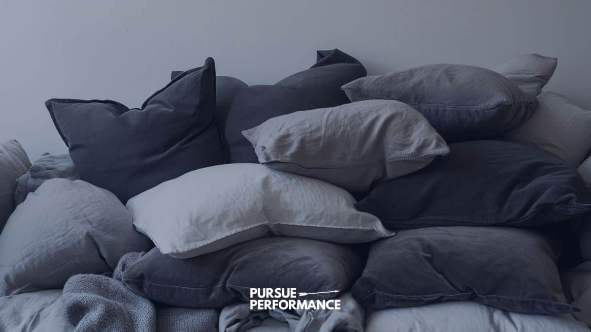
Cool Colors and Their Restorative Properties
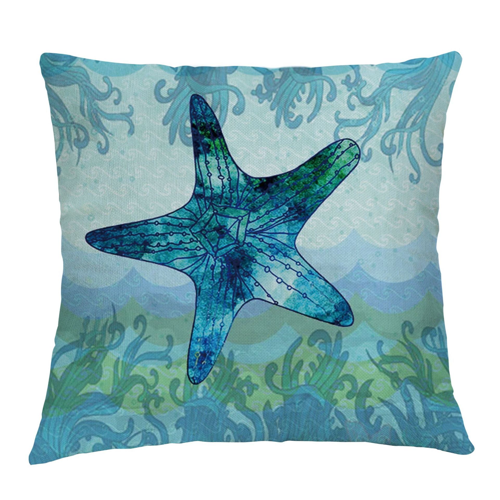
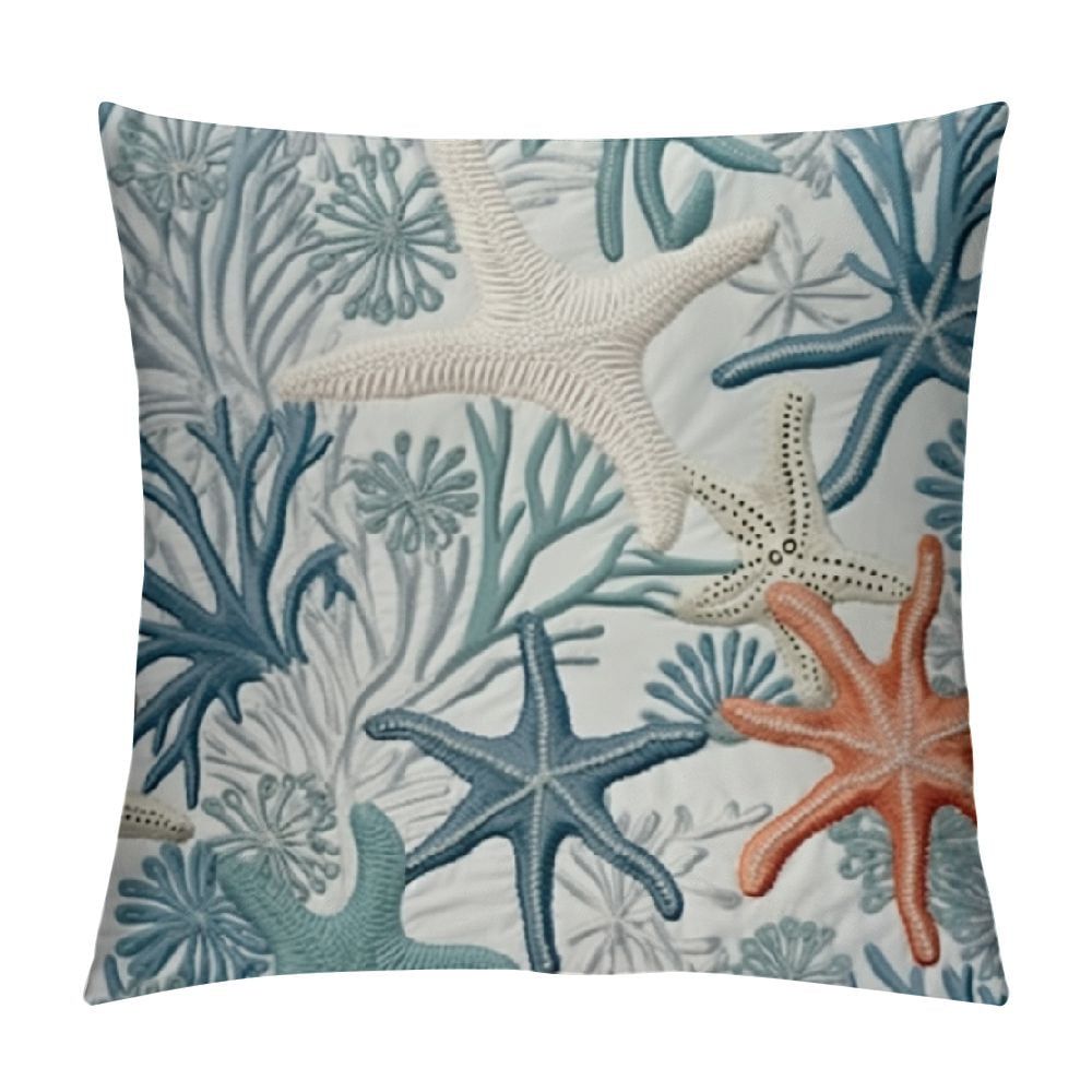
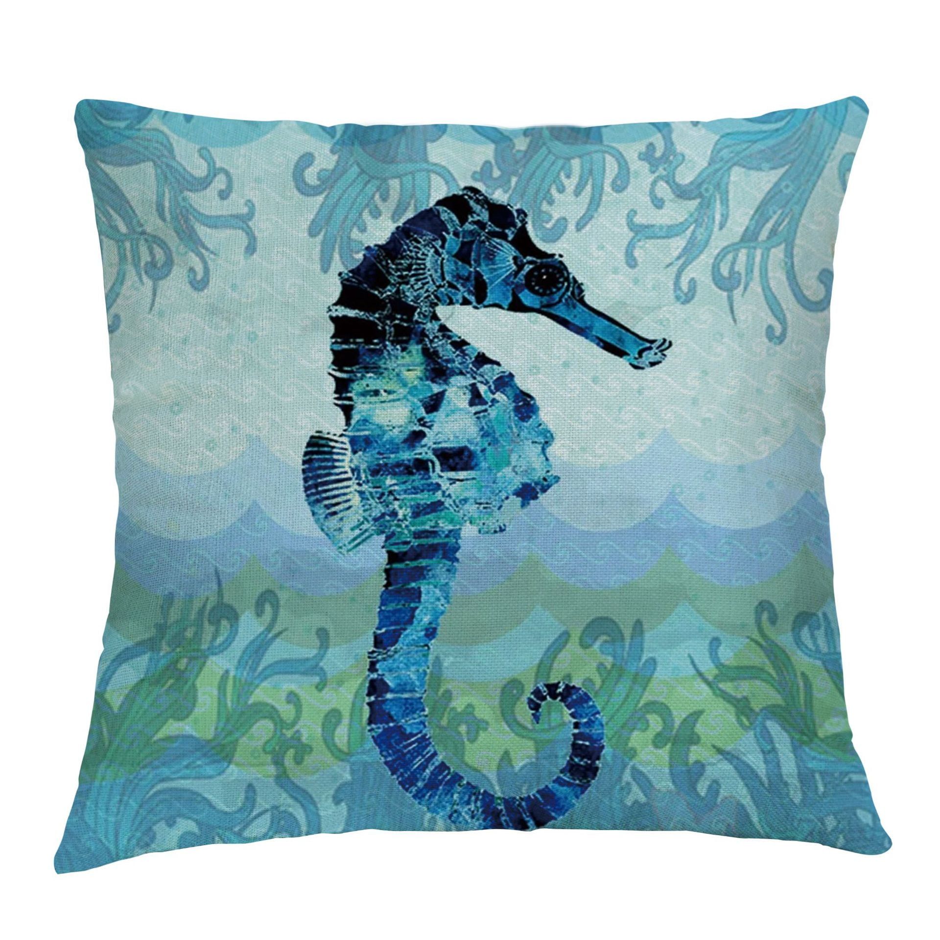
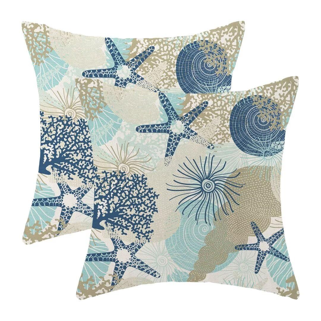
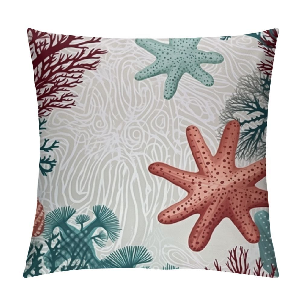
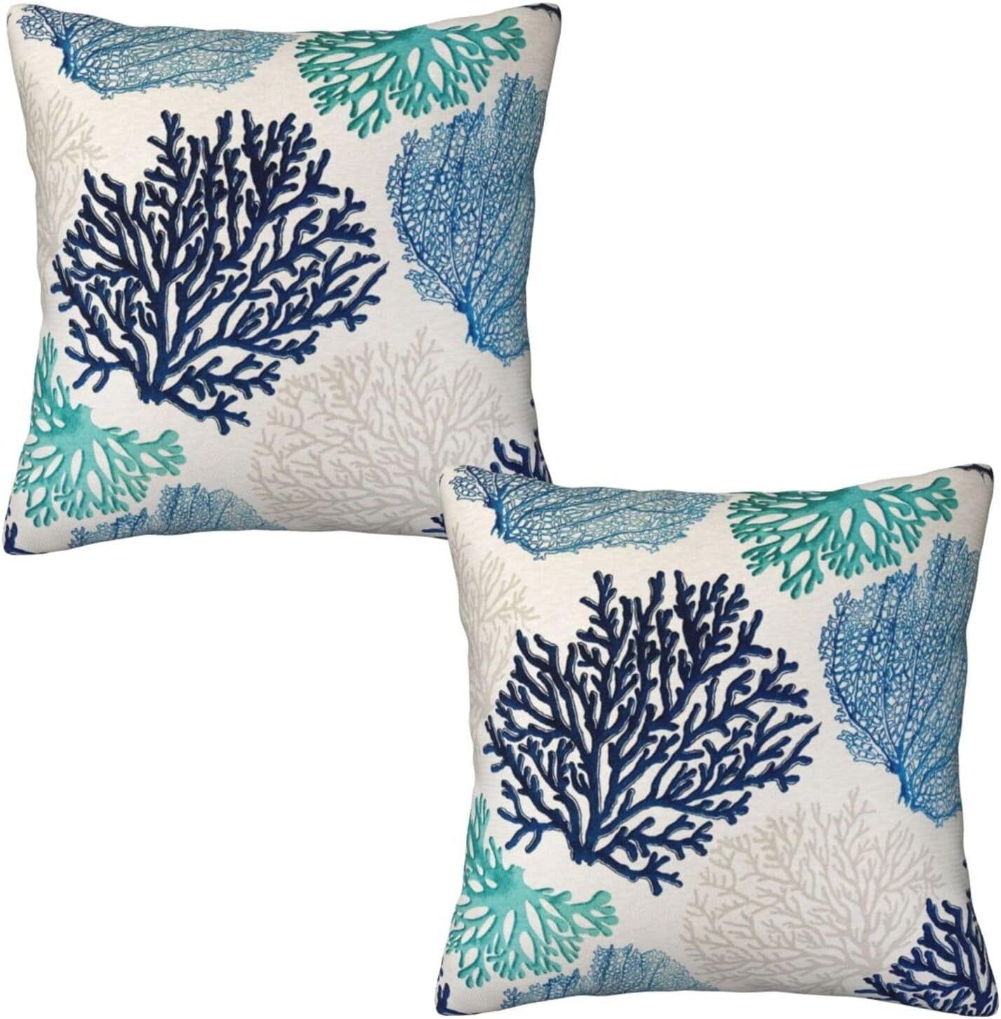
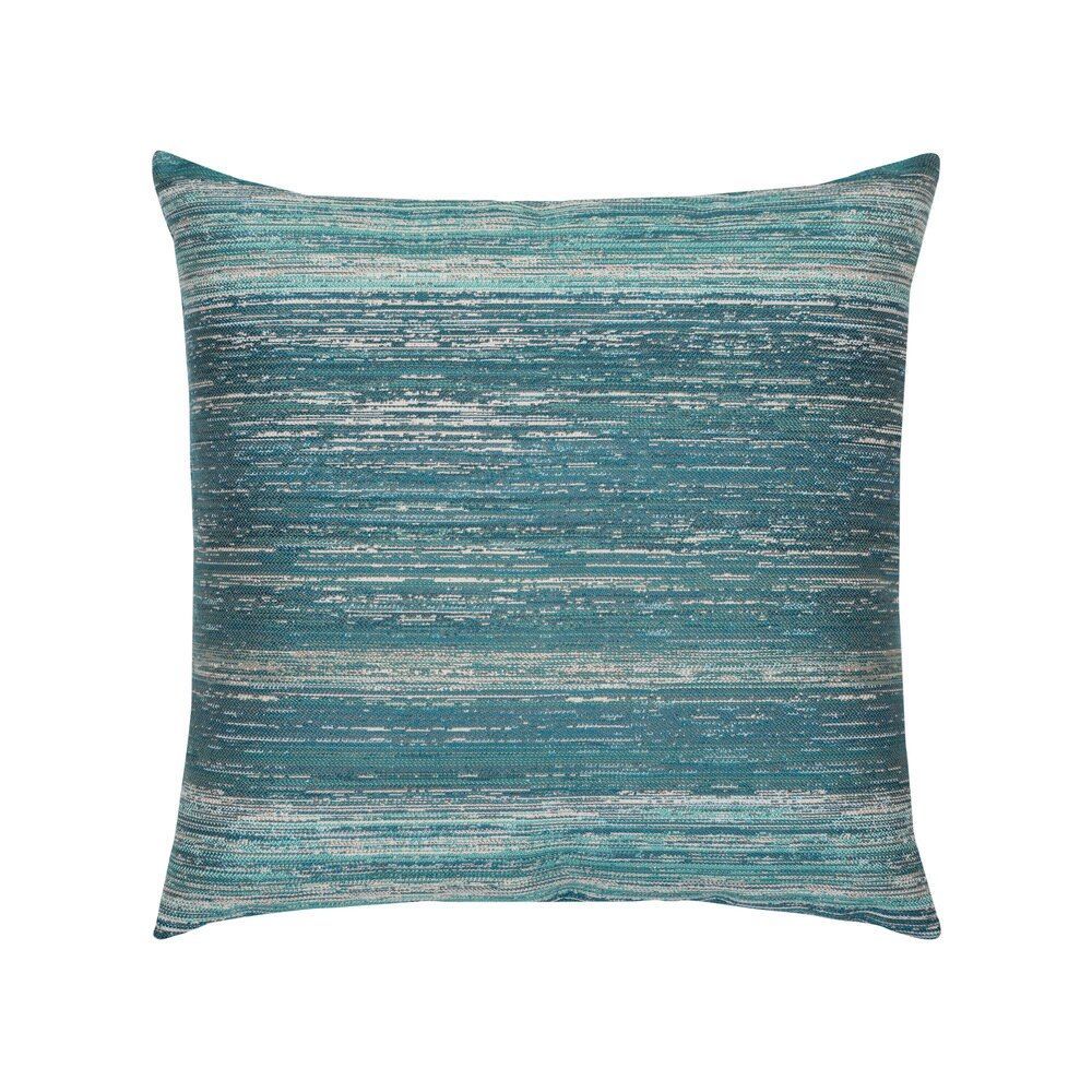
Cool colors including blues, greens, and purples have calming and restorative effects on our mental state. Blue, perhaps the most well-known cooling color, promotes tranquility and focus. It’s why many meditation spaces feature blue accents and why hospitals often use blue in patient areas. Green represents nature and balance, making it excellent for bedrooms or workspaces where you need to stay centered. Purple combines the stability of blue with the creativity of red, offering a unique blend that can inspire both reflection and innovation. In home textiles, these colors work beautifully in bedding sets, bathroom towels, and window treatments. A deep blue duvet might help you sleep better, while a green accent chair can provide a peaceful spot for reading. The beauty of cool colors is their versatility—they can make a space feel larger and more open. Lighter shades of these colors tend to have a spacious effect, while deeper tones create intimacy and depth. Using cool colors in textiles is particularly effective because they don’t require frequent replacement or updates like trendy patterns might. They offer lasting appeal because they naturally support our psychological needs for calm and equilibrium.
Neutral Tones and Their Versatile Role
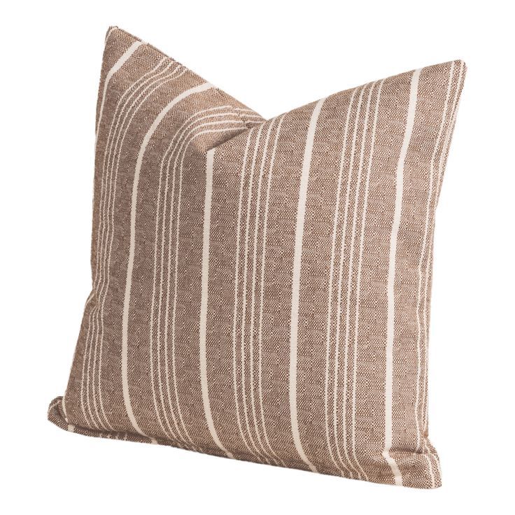
Neutrals like beige, gray, white, and cream serve as the foundation for most successful textile designs. They provide flexibility and balance, allowing bolder colors to shine while maintaining a sense of harmony. White textiles, for instance, can make small spaces appear larger and brighter, while gray adds sophistication and modernity to any setting. Beige and cream create a warm, welcoming base that works well in both traditional and contemporary interiors. These colors are incredibly practical because they pair easily with almost any other hue, making them ideal for frequently changing seasonal elements. A neutral bedding set can remain timeless while still allowing you to experiment with colorful accent pillows and throws. The key advantage of neutrals is their ability to adapt to different lighting conditions throughout the day. A white curtain might look crisp in morning light but take on a softer, more romantic quality in evening sun. This adaptability makes neutral textiles essential building blocks for any home design scheme. They’re also forgiving when it comes to wear and tear, as stains and fading are less noticeable on lighter tones.
Color Combinations and Harmonious Textile Pairings
Creating beautiful color combinations in textiles involves understanding relationships between hues. The color wheel provides a useful framework for selecting complementary, analogous, and triadic schemes. Complementary colors (opposites on the color wheel) like blue and orange or purple and yellow create dynamic contrast that can energize a space. Analogous colors (neighbors on the color wheel) such as blue-green-yellow or red-orange-yellow form harmonious groupings that feel cohesive and soothing. Triadic schemes use three evenly spaced colors around the wheel, offering vibrant yet balanced options. When combining textiles, consider the 60-30-10 rule: 60% dominant color, 30% secondary color, and 10% accent color. This approach ensures visual balance while allowing each element to contribute meaningfully to the overall mood. For example, a bedroom might feature light blue bedding (60%), green throw pillows (30%), and orange accent pillows (10%). Real-world applications show that successful color combinations often involve mixing warm and cool tones strategically. A neutral base with one warm and one cool accent typically creates the most visually appealing results. Remember, the goal isn’t to match perfectly but to create a pleasing relationship between all the colors present in your textile choices.
Cultural Considerations and Personal Preferences
Color meanings vary significantly across cultures, adding another layer of complexity to textile design decisions. In Western cultures, white often symbolizes purity and cleanliness, making it popular for wedding linens and hospital settings. However, in some Eastern cultures, white represents mourning and death. Similarly, red signifies luck and celebration in Chinese culture but can indicate danger or warning in others. Understanding these cultural nuances becomes important when designing for diverse households or clients. Beyond cultural differences, personal preferences play a crucial role in textile selection. Someone who grew up near the ocean might gravitate toward blues and teals, while a person who loves sunsets might prefer warm oranges and purples. Your past experiences, memories, and emotional associations with certain colors deeply influence your textile choices. Some people find that they feel more confident wearing deep burgundy or emerald green, while others prefer the simplicity of black and white combinations. The most successful home textile designs honor both universal psychological responses and individual personal connections to color. This means being willing to experiment and trust your instincts when selecting textiles that resonate with your unique story and lifestyle.
The world of home textile design is rich with opportunities to harness the power of color psychology for enhanced well-being and aesthetic satisfaction. Whether you’re drawn to the invigorating energy of warm tones, the serene qualities of cool colors, or the versatile neutrality of classic hues, each choice you make contributes to the overall emotional landscape of your living space. Remember that the best textile selections are those that align with both scientific understanding of color effects and your personal connection to specific hues. Don’t be afraid to experiment with different combinations or try new color palettes gradually. The most important thing is creating a home environment that feels authentically you while supporting your physical and emotional needs. After all, your textiles are more than just decorative elements—they’re daily companions that shape your experience of home. By approaching color selection with intention and awareness, you can transform ordinary living spaces into extraordinary reflections of your personality and wellbeing.